A Visual Design Technique You Can Use to Boost Your Conversion Rate Today
Hey I’m Shane, welcome to another issue of The CRO Weekly where each week I explore how to build a high converting Ecommerce store. If you’re not subscribed you can do so here:
If you enjoy today’s issue, the best way to support the newsletter is to simply share it with a friend:
There’s a silly bit of lore in the optimization world that goes like this:
Google once tested every possible variation of the color blue in order to learn which of them caused more people to hit the search button.
Is this true? Yes. Is it dumb? Yes.
The truth is - colors and ‘color theory’ are not going to have a measurable impact on performance. In fact, most purely-aesthetic things won’t.
But… there’s one part of visual design that can have a major impact on your conversions: visual hierarchy.
A page’s visual hierarchy is the order in which you see different elements on the page. This order is far from random. With fairly simple design changes we can manipulate what our users look at first.
With compulsive, short-attention-span users clicking through from a highly motivating ad – we want to make sure the elements that help them buy are the first things they see.
You don’t have to be a designer to manipulate this hierarchy - and I’m going to show you some of the most impactful changes you can make today.
Let’s get started.
Color
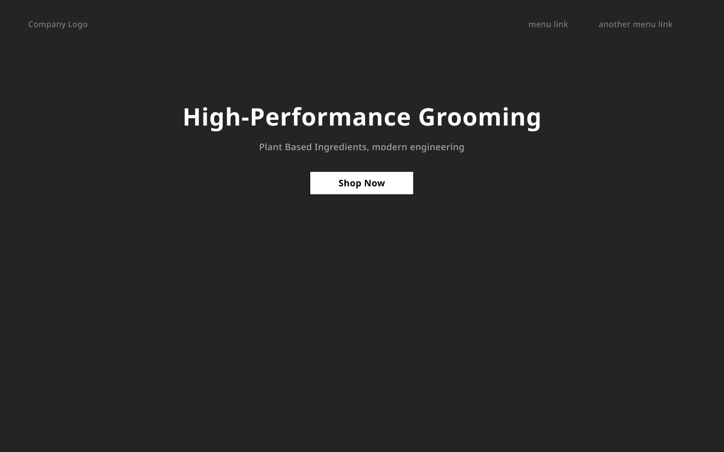
Does the color of an element matter? No. What does matter is contrast. Let’s look at an example:
What stands out to you on this page? Not much. It’s hard to tell there is even anything on this page. That’s because there is very little contrast between the text and the background. There’s also zero contrast between the different pieces of text. This may seem like an extreme example, but how often do you see a Shopify store with a hero looking like this:
Easier to read? A little bit. But again the contrast between the background and the text is minimal. Your eye is probably looking around the items in the image more than the pieces of text.
But let’s get back to our example. The current visual hierarchy is flat. Let’s use just a bit of color to manipulate it:
A good test to see what is higher up in the visual hierarchy is to simply squint your eyes and see what stands out. In this case, it’s obvious that the button is drawing our attention, and then the small headline and subtext, followed by the gray navigation links.
The problem is, the subtext melts together with the headline and looks like one long paragraph. We can reduce the contrast between that text and the background to make it stand out less like we did with the navigation links:
In this scenario the button is kinda cheating because it’s not only a different color but it’s also larger than the text. The headline and the subtext are also still too similar because they’re the same size. As you can tell, size is important - and it’s the next tool for manipulating visual hierarchy we’ll talk about.
Size
In our example, all of the text is the same size. The headline and subtext, navigation links, and the button text.
A simple way to move things up and down the visual hierarchy is to either increase or decrease their size. But before we make changes - let’s evaluate our goals. Of course we want people to be able to see the ‘shop now’ button right away. But it’s likely that without reading our headline and a bit of the subtext they won’t be ready to take action and start shopping.
So, our ideal visual hierarchy is: headline, button, subtext, navigation links. Let’s use size to do that:
Here’s what I did:
Changed the headline text from 18px to 48px
Change the navigation links from 18px to 16px
Change the button width from 151px to 207px
Give it another squint-test and you’ll see that we’re pretty spot on with our visual hierarchy at this point. If you do nothing else, size and color are the biggest factors in moving items around in the visual hierarchy.
This next set of items is all about fine-tuning.
Weight
Font weight is a small but important factor. Even without changing the design, does this not stand out to you more? Bolder font weights increase the size of each letter which creates more contrast. To implement this on our design, we’ll update that subtext and the navigation links:
Scroll up and down to see the difference between the examples. Very small details but now the subtext is firmly below the button and headline in the visual hierarchy, with the navigation links firmly at the bottom.
Positioning
English is read from left to right. Doing this so often has hardwired your brain to consume all information in the same way. We start at the top left, move to the right, and then skip back to the left consuming in a sort of Z formation.
Let’s imagine we had two buttons in our hero - a shop now button and a learn more button. Without using any of the other visual hierarchy tricks we can place one higher than the other by simply putting it on the left side:
Looking at this page you likely read the shop now button before the learn more. You can think of it this way – items at a similar place in the visual hierarchy will be consumed from left to right. (Technically meaning the item to the left is higher in the hierarchy)
Arrows
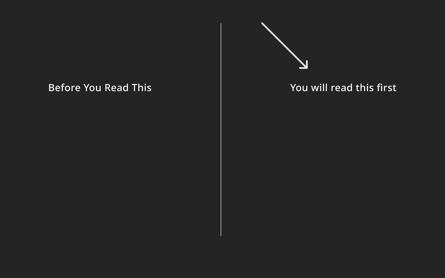
Your brain has a bunch of quirks. One such quirk is a slight obsession with arrows. Look at the following image:
Even though our english-reading brains are hardwired to read from left to right, an arrow can override that impulse. This trick may not have worked on you in this crude example but let’s see it the design:
Looking at this might actually make your brain hurt. Your impulse is to read the shop now first but we’re pointing at the learn more button. Overriding the visual hierarchy like this is a bad practice. Instead, you should use tricks like this to enhance the natural hierarchy –
A small change but feels much better.
Highlights (or another way to use color)
Thinking about our hero, what if we want the word ‘Grooming’ to stand out? We want to make sure when people read this they know we sell grooming products - nothing else.
We can add a background color, or highlight, to the word:
This being the only pop of color actually moves the word ‘grooming’ to the top of the visual hierarchy. In this scenario it hardly makes sense but it’s a great way to make important phrases within longer paragraphs more visible:
That’s all for today’s issue. If you want to see an example of me manipulating a real site’s visual hierarchy, check out the video in this tweet (and give it a share if you liked it!):

![Color Psychology In Marketing: The Complete Guide [Free Download] Color Psychology In Marketing: The Complete Guide [Free Download]](https://substackcdn.com/image/fetch/$s_!g-e-!,w_1456,c_limit,f_auto,q_auto:good,fl_progressive:steep/https%3A%2F%2Fbucketeer-e05bbc84-baa3-437e-9518-adb32be77984.s3.amazonaws.com%2Fpublic%2Fimages%2F44494be6-9adf-40bb-aaff-30617cebad89_770x676.png)


