Are Cart Drawers... Bad?

Hey I’m Shane, welcome to another issue of The CRO Weekly where each week I explore how to build a high converting Ecommerce store. If you’re not subscribed you join 901(!) people that are right here:
I hardly ever see a new store design that doesn’t use a cart drawer.
As with anything that’s popular, it’s good to ask the question: are people using a drawer because it’s good for performance or simply because everyone else is doing it?
Even if it works for some stores, it’s hard to believe that one cart type would be best for every store.
I recently had the chance to test this out with 2 different clients. Sadly, this post will probably leave you with more questions than answers—let’s get into it.
What’s the logic behind using a cart drawer?
The original cart UX is someone clicks “add to cart” -> send them to the cart page. Until around 2005, this was basically all you could do.
It’s easy to point out the issues with this, but the main one is that customers have to keep going back and forth to this page if they want more than one product.
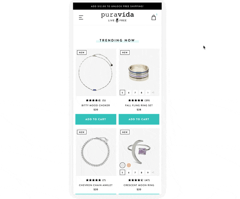
The idea for a cart drawer is that it gives you the best of both worlds. Customers would stay on their current page while also having access to view the contents of their cart. To continue shopping all they had to do was close the drawer.

On desktop screens this experience is slick, because the drawer only takes up 1/3 of the page. You can literally see the page you were just on.
Although on mobile the experience is different.
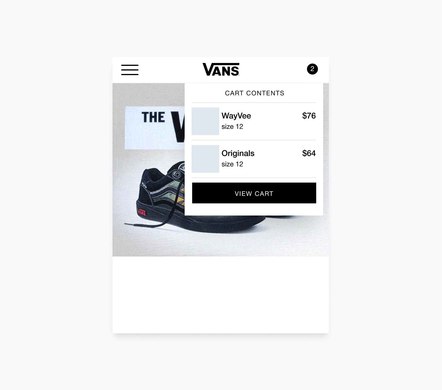
On mobile, cart drawers take up 100% of your screen. This entirely removes you from your previous context. The only way to get back to your shopping experience is to find the small “X” in the corner and close it out. Not too much different from a full cart page.
Compared to a cart page, you also lose access to any navigation elements. Sure, removing options definitely makes the checkout button the most visible element. In theory, this should improve CR by getting more people to take the action. In reality, we’re probably making it harder for people to shop for all the products that they want to buy.
At this point, you could argue that the only benefit is that we’re saving a page load. But carts have very little content and load very quickly. So… not much of a benefit at all.
Some tests with cart drawers
As mentioned above, I tested a cart drawer with two different clients. Why? Well, I honestly thought it was a better UX. Also, I sometimes like to test large structural changes (like a completely different cart) before doubling down and iterating.
So, here’s two tests and their results:
A store with a small product catalogue
This brand has a small catalogue and the typical customer only shops for 1, maybe 2 products. Their current cart implementation is a small notification and a link to the cart page. Here’s the impact of the cart drawer:
Mobile:
CR down 8.4%
AOV down ~1%
RPS down 10%
Desktop
CR up 17%
AOV up 8%
RPS up 24%
It’s interesting to see how big of a difference the UX can be on mobile vs desktop and what that means for performance. Sadly, mobile accounts for 80% of sales.
This test is still collecting data but I have a hunch the results stay similar – metrics down on mobile but up on desktop. It would align with how I think about the UX of each.
A store with a large product catalogue
This brand has over a hundred products and we wanted to test the cart drawer vs their current cart. After designing and building a new drawer from scratch, running the test, and checking back in after 4 weeks and 2,000+ transactions here were the results:
Mobile:
CR down 2.75%
AOV down 5.27%
RPS down 8.28%
Desktop
CR up .5%
AOV down 10%
RPS down 9.59%
In this case, the cart drawer was a clear loser on both desktop and mobile. Why is it doing so poorly in this test where as in the other it was mixed?
I think the answer is two fold:
customers are buying multiple products and going back and forth to the cart drawer is annoying
The current type they’re using is a “mini cart”
A mini cart is exactly what it sounds like—a small cart drawer that only shows the cart contents in a popup.
Once you click anywhere outside of the mini cart it will hide itself and you can reopen it by clicking the cart icon.
In some ways, this cart UX actually gives you the best of both worlds. You get an instant view of your cart contents and you get to actually stay in your shopping context. You can almost think of it like adapting your desktop cart drawer to give it the same advantages on a mobile screen.
This line of thinking may also be why Shopify’s new Dawn theme comes prebuilt with cart notifications, not a cart drawer:
Like I said, this post is going to leave you with more questions than answers. Should you switch off a cart drawer? Should you try a mini cart? I honestly don’t know.
What I do know is this: cart drawers are definitely not to be considered a best practice.
That’s it for this weeks issue. I’d love to chat all things cart drawers with you over on Twitter:

