
Are We Building Ecommerce Stores All Wrong?
Are We Building Ecommerce Stores All Wrong?

Hey I’m Shane, welcome to another issue of The CRO Weekly where each week I explore how to build a high converting Ecommerce store. If you’re not subscribed you can do so here:
This issue is a tough one to write. Without being too extreme, I don’t think I’ve ever been so wrong about something so fundamental.
Here’s the story:
I started working with a new client and went through my typical research process. User tests, surveys, auditing the store, etc…
One seemingly obvious opportunity to optimize was their homepage hero. When you land, you’re presented with a short headline and a grid of their 4 primary products:
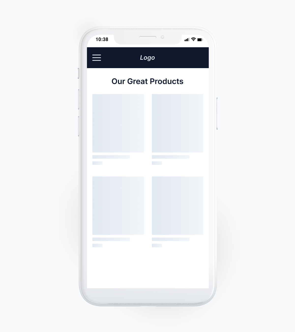
This goes against arguably the most popular design pattern in all of Ecommerce. Look at a hundred stores and you’ll see the same thing –
Image of the product
Value proposition in the headline
(Sometimes) supporting copy
Shop Now button that leads to a best-seller or collection

You’ve probably heard it a dozen times (and I’ve recommended it a dozen times) that you should lead with your core value proposition and link to a best-selling collection or product.
The logic behind this is that when someone lands on your store you should immediately answer the question in their mind “What’s in it for me?” By answering that question you peak their interest and win a bit more of their attention.
With this strong belief in mind I designed a test that looked like this:

We analyzed 1,000+ survey responses and hundreds of reviews. It was clear that there was one primary thing people were hoping the product would do for them. That’s what we based the copy on. The image was a mix of lifestyle and product photography that highlighted the result people were supposed to be getting from the product. The link was to their best-selling bundle—a smaller version of their core product that acted as a sampler and historically had a high post-purchase LTV.
We really tried to make sure that we thought through everything for this test and didn’t just throw something mediocre up.
The result?
The original variation out-performed the updated hero with research-driven copy by 10% every day over the course of the test.
(The thing to focus on in this chart is the dotted line and the solid blue line. The solid blue line represents the benefit-driven hero and the dotted line represents that original.)
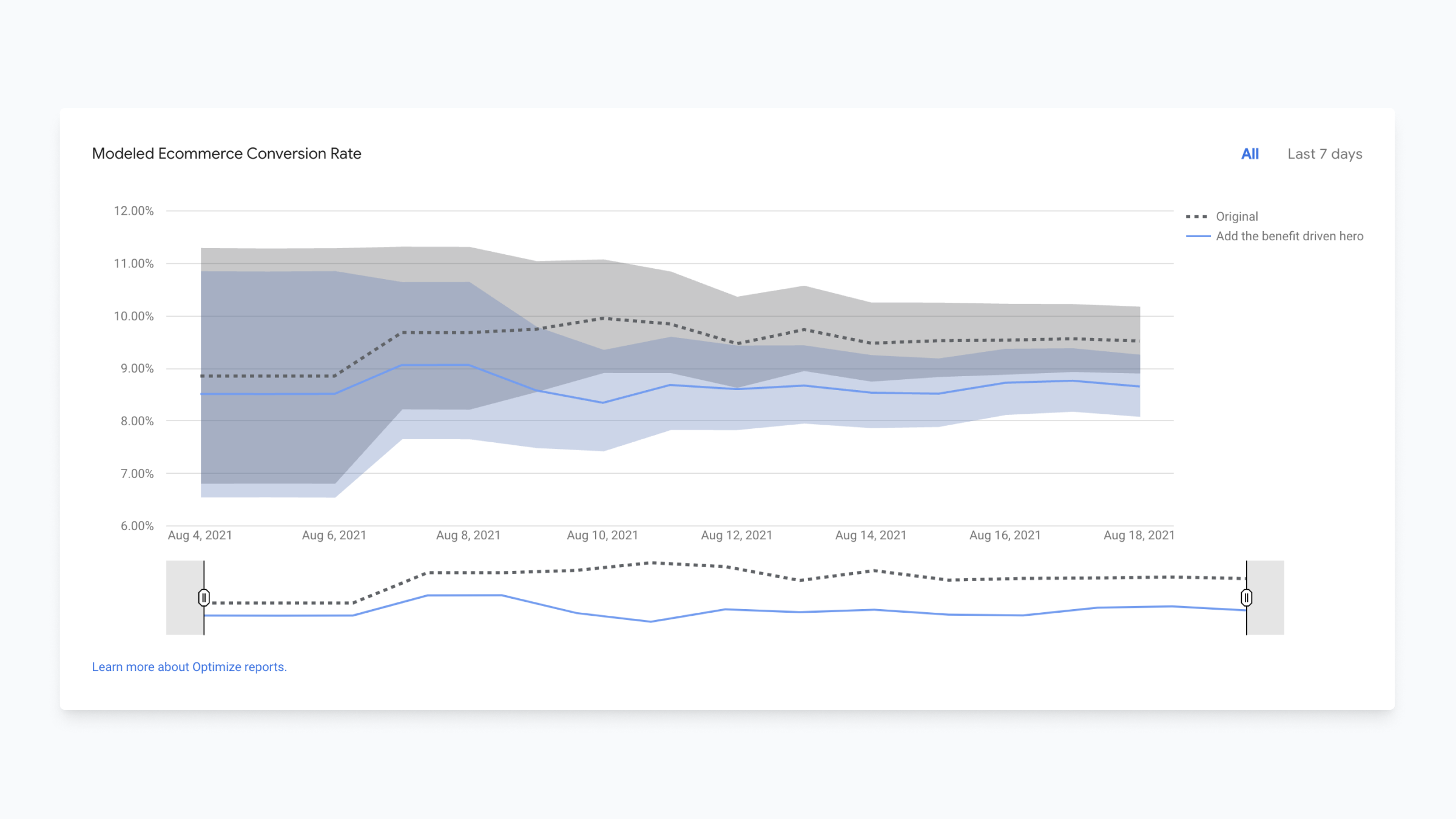
There wasn’t a single day in the test that the benefit-driven hero performed better.
I had a hard time believing this result. I segmented down in a bunch of different ways:
Web visitors
Mobile visitors
Direct traffic
FB/IG traffic
Search Traffic
People who purchased the collection we linked to in the hero
People who didn’t purchase the collection we linked to in the hero
In the end, no matter what way I sliced it, the answer was the same—the 4-product grid performed better.
So where do I go from here? Well, like I said, I’m having trouble accepting this result.
I’ve relaunched the test with the link pointing to a collection of their best-selling products instead of to their starter bundle just to see if that’s the issue. If that’s not it, I’ll likely run the test again with new copy or a different CTA or a different image.
But in the end this brings a bunch of things to mind…
Had this been a ‘complete redesign’ where we didn’t measure the actual impact of each change I would have been certain my changes were an improvement. Before running this test, I would have argued that the change was absolutely necessary and had no doubt it would be the right thing to do.
Maybe our current way of building Ecommerce stores—following the best practices of other stores that followed the designs of stores that came before them without ever testing things—has led us to a point where we don’t actually know what the best Ecommerce experience looks like.
I have to ask you: Are we building Ecommerce stores all wrong?
I’d love to talk with you about this on Twitter:

