

Grocery Stores Are AOV Machines
Or, how you can improve your site's performance by deliberately choosing how your customers shop.

Hello I’m Shane and welcome to another issue of The CRO Weekly where each week I explore how to build a high converting Ecommerce store. If you’re not subscribed, join 256 other smart folks by subscribing here:
Grocery stores are AOV machines.
Hear me out…
Have you ever noticed how the milk, bread, and eggs seem to be on the complete opposite end of the store?
Have you noticed that the end caps are filled with discounted products that you probably don’t need but might as well buy?
Have you noticed that the chips that just happen to be on sale have a very convenient rack of overpriced dips running along them?
None of this is by accident.
The milk, bread and eggs are deep in the store so you have to walk past a bunch of other products on your way. The end caps are filled with discounted items so that on your way through the store you’re likely to buy something compulsively. The dips are a high margin item that you’re very likely to buy if you get those chips on sale.
You see, grocers have one job. To get you to spend the most amount of money possible every time you enter the store.
To do that, they’ve deeply considered your path to the checkout line.
The World of Ecommerce
In Ecommerce, things aren’t so different. While people don’t walk your physical store, they browse, hover, click links, and ultimately pull out their credit card.
You may think that you don’t have much control over how people shop your store but you do. Just take this example from Patrick Codou of Supply.
Knowing that most people click on the first call to action in the hero of his homepage, Patrick started to consider where that link pointed to.
For the longest time he thought their starter set was the best way to get started with the brand. It not only included their infamous single-edge razor, but also some shaving cream, a brush, and a shaving bowl. In one purchase it got people started on all of their products.
The question you should ask yourself here is: is this how I wish our customers would shop or is this how our customers actually want to shop?
Patrick decided to run an experiment and the results were substantial:
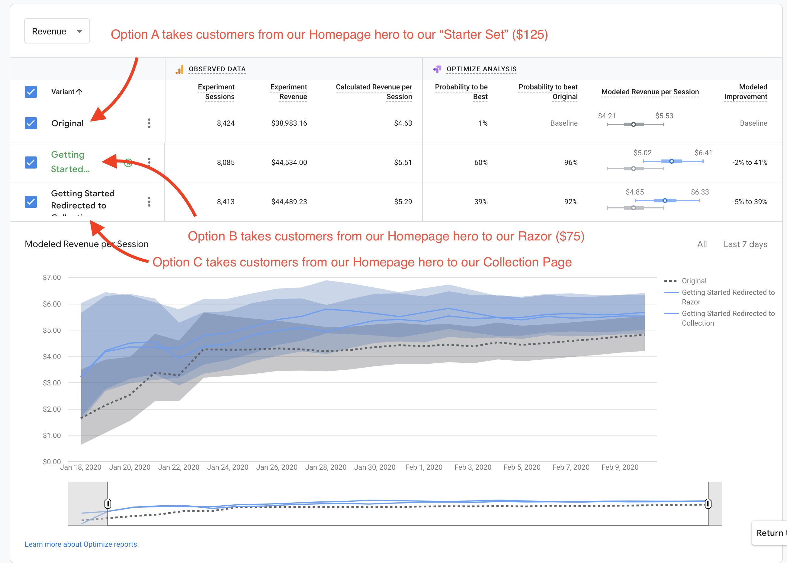
Linking to the razor resulted in a RPS (revenue per session -or- conversion rate * AOV) of $5.51.
Linking to the starter set resulted in a RPS of only $4.63.
That comes out to an almost 20% increase in revenue for visitors that click on that link!
Being deliberate in choosing how Patrick’s customers shop his store resulted in thousands of dollars in additional revenue each month.
P.S - If you visit Supply’s site you’ll notice that Patrick settled on sending that hero traffic to a collection of all his products, which performed very similarly to sending people to the razor. This decision (I believe) was made because when you think about it, performance being equal, viewing a curated collection of products is a better experience than seeing one hero product as a new customer.
Choosing How You Display Your Products
Altering your site’s navigation isn’t the only way to change how your customers shop. If we’re honest, most Ecommerce stores default to sending people to a collection of all their products. At best they may break them up into categories.
Let’s look at brainflakes.com as an example. They make interlocking disks that you can build things with like legos. Along with the pieces themselves, they sell building instructions (showing you how to build something) and task cards (challenges to build things yourself).
If you scroll down after landing on their site, you’ll see this grid of their best selling products:

Now imagine, probably like you are, that you’re seeing this for the first time. You see the 500 piece set, a task card, a 2500 piece set, and then a building instructions card. I don’t know about you but I’m already kinda confused. I still don’t really know what any of this means and I don’t know where to start.
I could click on each of these and spend time reading the descriptions to get an idea of how this all fits together. But you should ask yourself a question:
Is anyone going to buy the building instructions or task cards before buying a set?
Definitely not. So why am I seeing this?
I get a similar experience when I click on the ‘shop’ button in their hero. It sends me to a collection of all their products:
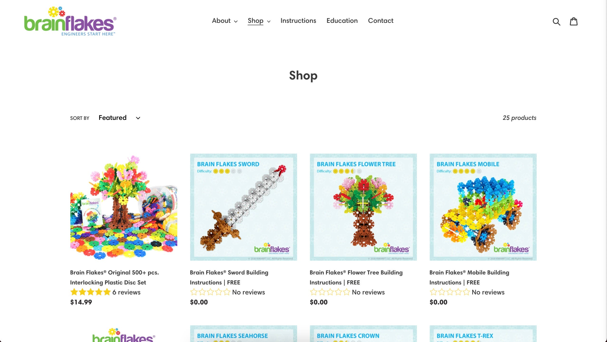
3 of the 4 products I see here are free products. At the very least, showing these to customers at this stage along the purchase path is just going to distract them.
Right now the default purchase path is:
Home -> shop all products -> sift through instructions, task cards, and sets -> check out 500 piece set -> go back to collections -> check out 2500 piece set -> add to cart -> go back to collections to view instructions -> go to free instructions PDP -> Add free instructions to cart -> Go back to collection -> Go to other free instructions PDP -> add to cart -> repeat until you’ve add all the free instructions and training cards -> checkout
When I list it all out, it seems pretty crazy what we’re asking customers to do. Thinking about how we can improve this experience, a number of ideas start to come to mind. What if:
We consolidate the 500 piece set and the 2500 piece set into one product with the number of pieces being a variant. We can turn this PDP into a sales page for the sets and have information comparing the two and what you get from purchasing them.
We send customers that click on our homepage hero CTA straight to this ‘sets’ product.
Instead of ‘best sellers’ on the homepage we could focus on selling the sets.
We remove the ‘shop all products’ collection altogether.
Instead of offering some of the instructions for free, we include all of them as a free bundle with the purchase of a set. Then, the instruction sets that aren’t free can be listed as ‘premium instructions’ and used as cross-sells in the cart, checkout, and post-purchase. We could do the same with task cards.
With these changes, the default purchase path is much simpler:
Home -> view sets PDP to compare difference between 500 and 2500 piece set -> Add to Cart (Bundle of all free instructions + cards is already added) -> In the cart, see option to purchase premium instructions -> checkout
By simply reorganizing the way we present products to customers we were able to dramatically simplify the shopping experience.
That’s all for today! If you enjoyed this piece, please do me a favor and let me know on Twitter:

Thanks for reading, and see you next Wednesday!