How to Find Opportunities to Improve Your Store's Conversion Rate
How to Find Opportunities to Improve Your Store's Conversion Rate

Hey I’m Shane, welcome to another issue of The CRO Weekly where each week I explore how to build a high converting Ecommerce store. If you like this issue, I’d really appreciate if you would share this post with a friend:
If you’re new here, you can subscribe to get the next issue delivered straight to your inbox:
The most common question I get is “Where do I start?”
The answer isn’t to create bundles or a free shipping threshold or in-cart up-sells. Instead of jumping to tactics you want to start with research.
I know… research is boring and tedious and time consuming. But it has to be done. And if you’re going to do it, you might as well have a system for it.
So today I’m going to walk you through how I start every project with a heuristic analysis (a fancy way to say auditing your website based on a set of criteria you know will impact conversions).
First Things First
Before we start, there’s one thing you need to keep in mind: an effective page has a single goal we want users to accomplish.
For an Ecommerce store that is:
Home -> Get people shopping
Collection -> Get people to view a product
PDP -> Get people to add to cart
Cart -> Get people to checkout
When you go to analyze a page on your website you need to have this goal in mind.
Why? Let’s take your home page hero as an example. The first button at the top of every Ecommerce store is a CTA to ‘shop now’'. That’s not on accident. That’s because the number 1 goal of the home page is to get people shopping.
If your goal is to get people to read your about page then it only makes sense that link would point to the about page. Right?
If instead you have a high ticket product and your primary goal is lead gen, then you should have an email capture offer in your hero.
It’s important to keep this in mind as you’re evaluating pages on your website or else you’ll accidentally end up optimizing around the wrong objective.
A Structured Approach to a Heuristic Analysis
The goal of this analysis is to generate as many insights as possible. You’re not going to get clear answers just looking at your site, but instead ideas that you want to research further / experiment with. Because of that, I like to go through this analysis one page at a time with a Google doc open to take notes.
Let’s jump in:
1) Is Your Primary Goal Aligned With Your Users' Buying Stage?
The buying process for high ticket products is very different than a $10 widget. Buying a new mattress will have you scouring the internet comparing every option. A $10 widget can be bought just because it’s funny.
A simplified way to think about buying stages is in three steps:
Awareness – when a customer first becomes aware of your product. Or could also refer to the point where a customer first becomes aware of a need that they want to fulfill.
Consideration – when a customer starts evaluating solutions to their need.
Purchase – people are ready to spend money.
It’s hard to generalize here because every product at every price point for every audience is a bit different. Let’s take your home page as an example.
Low Ticket Products
Low ticket products have the benefit of being able to be purchased on impulse. They’re also usually not that complicated. So, a buyer probably goes through the awareness and consideration phases in seconds, not minutes or hours.
If someone sees an ad for a low ticket product and lands on your home page, they may already be ready to purchase. So when picking our primary goal for the page it may make sense to optimize around add to carts instead of getting people to click to the PDP.
That’s an example of aligning your page’s goal to your users stage in the buyers journey.
High Ticket Products
High ticket products are a different beast. It may take hours or days for someone to move through the different buying stages on their own. The average person that visits your home page is not ready to buy. I’d say they’re either just becoming aware of the problem or they’re actively considering options.
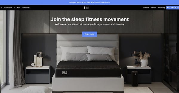
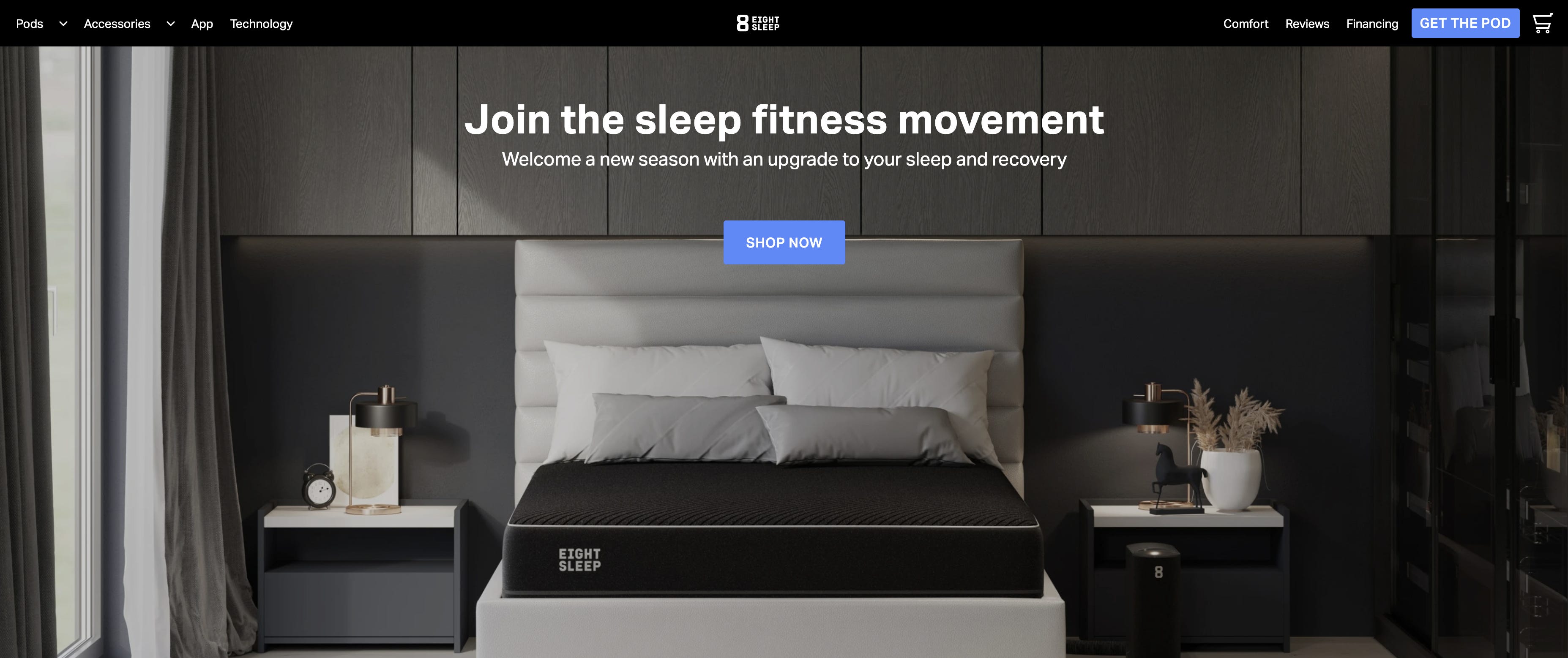
In this stage, our goal may again shift away from getting people shopping and instead sending people to more in-depth product-specific landing pages. A great example of this is eightsleep.com
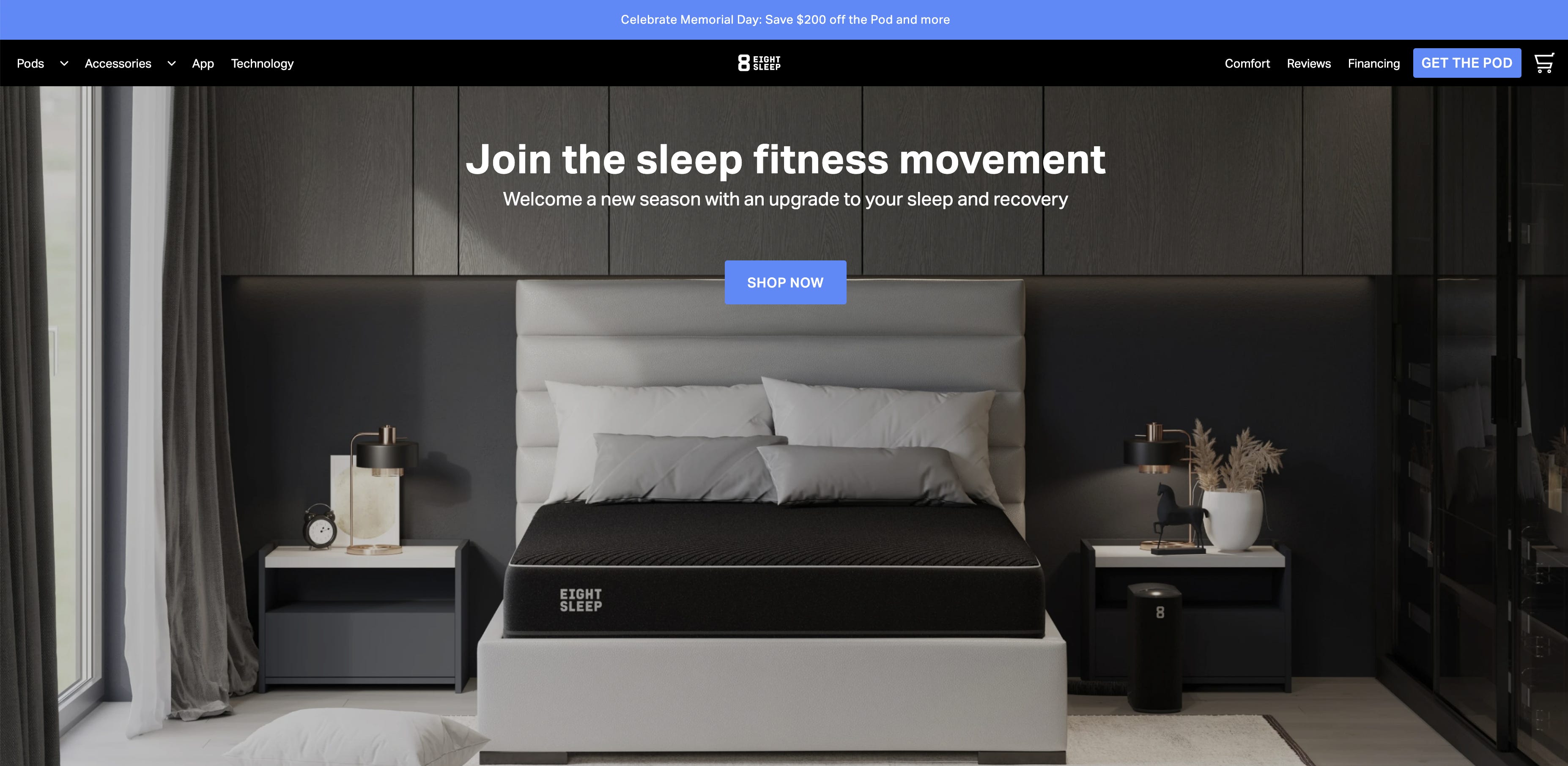
The call to action in their hero is still ‘shop now’ but when you click it you’re brought to a product landing page instead of a product detail page. The key difference being that the landing page is 100% focused on educating and doesn’t have a buy-box:
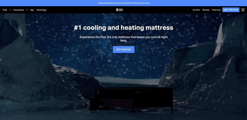
As you can see, their primary goal for the home page is to get people to learn more about the product. Put another way – it’s perfectly aligned with the average home page visitor’s buying stage.
These examples show you the two extremes. Thinking about your specific product and customer will land you somewhere on this spectrum.
2) Assess Each Page For Clarity
Ask yourself, is it clear what's being offered and how it works?
You can think about clarity in both the content and design of your page. At CXL, they recommend you asses content clarity by whether or not you can instantly answer the following questions on any page:
Where am I? What is this page about?
What can I do here?
How is it useful to me? Why should I do it?
Can I understand what the product/service is, and how it works (in a reasonable amount of time)?
Are there supporting images and/or videos that help me understand it?
Is the product information adequate / sufficiently thorough for making a decision?
Are all important associated pieces of information clear (pricing, shipping info, warranty, return policy, etc)?
Is it clear what I have to do next?
Go through each of these and give your site an honest assessment.
Then, we want to asses design clarity.
The most important question to ask yourself is 'Is there a strong visual hierarchy in place & does it follow our intended goal for this page?'
Visual hierarchy is essentially making things that are most important stand out while making the least important actions less pronounced. For example, look at the following two screenshots.

In the first image, is it obvious what they want you to do? Now look at the second and ask yourself what they want you to do.
An easy check is to do a squint-test - squint your eyes and try to see what stands out.
In the first image, the black and white melt together. On the second image, the green button is begging for your attention.
Also, look at the button text for the two of them. One says "Got 'em" and the other says "Shop Now". Which is more clear in telling you what they want you to do?
Here’s a video that explains the concepts of visual hierarchy by example:


3) Evaluate How Relevant Your Content is to Users
It's important to understand the context your average user has when visiting your website. Does the page relate to what the visitor thought they were going to see? Does the message they saw before they clicked to your website align with the message they're seeing now?
To know this, you need to look at all of the ways users are getting to your website. If your ads say you offer 'natural deoderant' and then you send people to your home page with the hero ‘beauty products’ people may be confused.
To determine relevancy, ask yourself questions like:
Does the headline match the page content?
Do call to action buttons match the value they’re going to get?
Are the images on the page relevant to the content?
If the user came from an external site (Google search, PPC, referral, etc), will they recognize that it’s a continuation of their journey?
Basically, the easiest way to lose someone is to break the logical flow of what they thought was coming next.
This is why product/offer-specific landing pages can have such a significant impact on conversions. Imagine you’re running an ad campaign for father’s day but sending everyone to your default home page. The person who landed is stuck wandering around your site looking for more details on the father’s day sale. Instead, you could send them to a landing page with more info about the sale and a list of products / bundles / offers that they could take advantage of.
It sounds silly but this is what 90% of brands are doing!
4) Evaluate Your Page For Points of Friction
Friction is anything that slows users down when they're trying to take the desired action. Website forms are a great place to start. Think about filling out a website form that has 20 fields. That's a lot of effort. Now, think about a website form that has 5 fields. You're much more likely to fill that out.
But the number of fields is only one potential point of friction. Imagine if the same 5-field form had a field "Social Security Number (Required)". Chances are you'll never fill out that form unless you have a ton of trust in the brand or you know they actually need your SSN.
Here are a bunch of other potential points of friction:
Long and complicated processes. The easier it is to do something, the more people will do it.
Asking people for sensitive information. The more personal you get, the fewer people will feel comfortable sharing.
Slow loading pages. Slow sites drive people nuts, especially on their phones.
Difficult to find features or content. Whenever something is difficult, not obvious or intuitive, you're causing friction.
Design of the website. If it looks spammy or amateur, it. will turn people away.
Obvious doubts and hesitations the page might cause.
Privacy and Security concerns
Complicated language.
usability problems
Technical errors
Low contrast between text and background colors.
A great example of introducing friction is Purple’s PDP: (h/t @daverekuc for sharing)
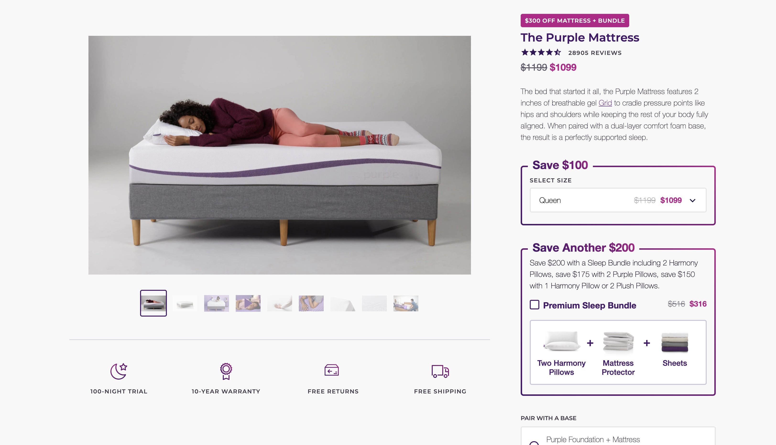
They’re running a $300 Off promotion but the $300 off is for the mattress AND the bundle of extra stuff. They do a decent job of explaining it but if you head to the page yourself you’ll probably get confused pretty quickly.
Any time you add some sort of complexity you’re going to see a drop in conversions. But, for a brand like Purple they probably have low repeat purchase rates. So the trade-off of increased AOV for a decreased CR may work for them.
The challenge here is that the offer is inherently hard to communicate.
5) Identify Every Distraction
As I've mentioned, every page on your website should have a clearly defined 'most wanted action' - what is it that you want your visitors to do on this page? Anything that doesn't contribute to a user taking that action is probably a distraction. Anything that's a distraction should be minimized or probably removed entirely.
Here are some ways to identify distractions:
Are there any moving, blinking elements such as banners or automatic sliders?
How many elements on the page don’t contribute to someone achieving the goal on the page?
Could we remove these elements from the page without compromising its performance?
Are there navigation elements that could be removed?
Is your navigation header small and compact or is it taking up a lot of space?
Are there any items of lesser importance high in the visual hierarchy?
Identifying what is a distraction and what is important can be difficult. On your product page, is the ‘our story’ content helping motivate people to purchase or distracting them?
Those are the tough ones that you really need to consider on a case-by-case basis.
But others are easier. Do you, for example, have anything animated / moving on your page? Unless it’s drawing peoples’ attention to information that will help move them closer to achieving the page’s goal then it’s probably a distraction.
Other common ones are:
unconsidered pop-up modals
floating widgets like chat, ‘feedback’, etc
Long paragraphs of text
Buttons that are high in the visual hierarchy (grab your attention) but lead people away from the primary goal of the page.
6) Evaluate Whether You Have Proper Motivation and Incentives
You want people to take the single most important action on your page. Are you doing a good job convincing users as to why they should do that?
Here are the key questions for evaluating motivation & incentives on a page:
Is there a clear offer?
Is it easy to understand why someone should take the action?
Is the value your product provides clearly explained?
Is the copy persuasive?
Now What Do We Do With This Information?
Once you've gone through each of these 6 steps of analysis for every page on your site you should have a long list of ideas. Ideally, you should now go and look at your website analytics to find data to back up your ideas. Whether or not you're able to do that, the next step is to rank-order changes based on a 5-point scale:
1 - This change is likely to have a major impact on conversions and will not require a lot of work.
2 - This change will likely have a major impact on conversions but will require a lot of work.
3 - This change will likely have an impact on conversions and will require a fair amount of work.
4 - This change will likely have a minor impact on conversions and does not require a lot of work.
5 - This change will likely have a minor impact on conversions and will require a lot of work.
By ranking your list based on this scale you will know which changes are low hanging fruit (1's), which changes are a lot of work but worth the effort (2's), and which changes are likely to not be a priority until everything else has been implemented (3, 4, 5).
Estimating the impact a change can have is the tricky part. But this post is long enough already!
That’s all for today! If you enjoyed this piece, please do me a favor and let me know on Twitter: