Seeing is Believing in DTC
Seeing is Believing in DTC
Stop overlooking the power of images and visuals

On an episode of Playing for Keeps Helena Hambrecht, Co-Founder of Haus, said:
“someone can look at a Haus photo and inherently understand exactly where you're supposed to drink it, that you're supposed to drink with other people, that you're supposed to drink it in a certain way, that you drink it with dinner or you drink it at a Netflix night or whatever it might be. We can solve so many of those problems visually so that we don't have to take up the space writing copy that feels like top down and forceful, there's just so much nuance in how you can instruct people how to use a product. So for me, it was context, most products actually are used outside of a vacuum and outside of a photo studio with a color backdrop.” (emphasis mine)
There’s not only nuance in how you instruct people to use a product, but also in how you explain a product’s benefits. As far as tools for the job, there’s two: copy and visuals.
Copy, as Helena puts it, is heavy-handed. While it’s necessary to ensure certain details aren’t lost in interpretation, our brains process images 60,000 times faster than text.
Compare an image from Haus’ website to another alcohol brand and try to answer the following questions:
What type of person drinks this?
What’s the right occasion for this drink?
How are you supposed to drink this?
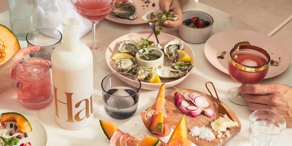
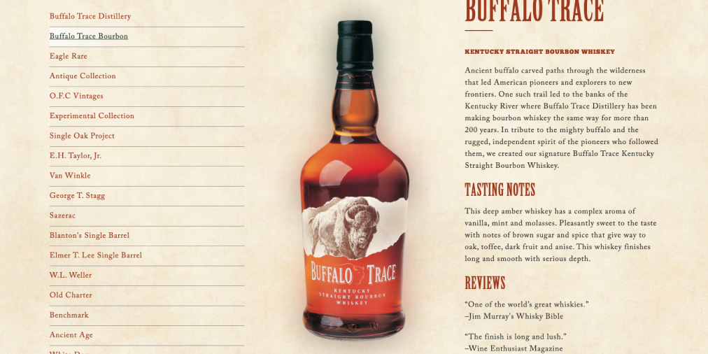
The difference is clear.
You Can Also Use Images to Sell
Images aren’t only effective in communicating how your product can be used. They’re also a powerful tool to demonstrate how your product solves your customer's specific need.
For example, a client I’m working with sells high-end cookware with an award-winning design. One of the problems their product solves is needing 15 pans to cook different meals. With their product, you can cook in a dozen ways with only two pans.
Currently, their website tries to explain this by showing different things being cooked with their pans. Something like this:
(this is not actually what it looks like but extremely simplified for an example)

Seeing this you think: cool, I can cook different things. The problem is, this doesn’t bring to mind the specific problem they’re solving. What they’re trying to do is show you how you can replace 15 pans with 2. They can’t possibly have 15 images of every different style of cooking without it being overwhelming.
What if, instead of showing the pans in action, they used a visual that contrasts your current cooking setup with what it could be. Again, you’d want to put effort into something better but here’s the seed of the idea:

Left: All of your pans.
Right: what you can replace them with.
This image brings the specific problem they’re solving for you to mind and you’re more likely to think - ‘wow, I really do have a ton of pans! I could really use that extra cabinet space….’
That’s all folks.
That’s it for issue number 5. Short and sweet this week. There’s a lot more to say on this topic and maybe I’ll expand on it if you like this post. Remember, your images and visuals are powerful tools in persuading your customers. Don’t overlook the importance of them.
If you enjoyed this issue, please share the Twitter thread here:

Unofficial Sponsorship Section
This issue is unofficially brought to you by the eCommerce Playbook Podcast. I recently listened episode _ where Andrew Faris and Taylor Holiday talk about marketing campaigns. Specifically, what happened to them? I think this is an important conversation in a world increasingly driven by performance metrics. Check out the episode here.