
Why Landing Pages Perform So Well for DTC Brands
Why Landing Pages Perform So Well for DTC Brands

Hey I’m Shane, welcome to another issue of The CRO Weekly where each week I explore how to build a high converting Ecommerce store. If you’re not subscribed you can do so here:
If you’ve been in the DTC twitter-sphere for any period of time you’ve heard Nik Sharma talk about how one landing page can have a massive impact on your advertising performance.
We’ve seen plenty of examples but the question that’s rarely answered is… why?
What is it about landing pages that are different from a PDP or standard home page?
That’s what I’m going to talk about in today’s issue. Let’s get started.
Relevance is hard to come by in Ecom
We’ve all seen an ad promoting a sale that was highly motivating. You click the ad and land on the store’s home page with no mention of a sale. What gives?
In a matter of seconds you went from highly motivated to ‘is there even a sale going on? Did I miss it? Where can I find it?”
This is the problem with relevancy. When you show users one thing and they click through to see something else entirely it can be really confusing. The sale example is hopefully happening less these days so let’s look at a specific example:
Send A Friend
Send a friend primarily sells one thing – small plush toys that you can gift to a friend. Over the course of the last year they’ve grown substantially and are continuing to scale at a rapid pace. (You should follow their founder on Twitter)
Here’s an example of an ad they’re running:

What do we see here?
The stuffed animal penguin
The ability to send a personalized note
The 10% off discount
All around this sounds like a great idea and something I would consider buying for my partner as a fun surprise gift. Let’s click through to learn more.
Here’s where we land:
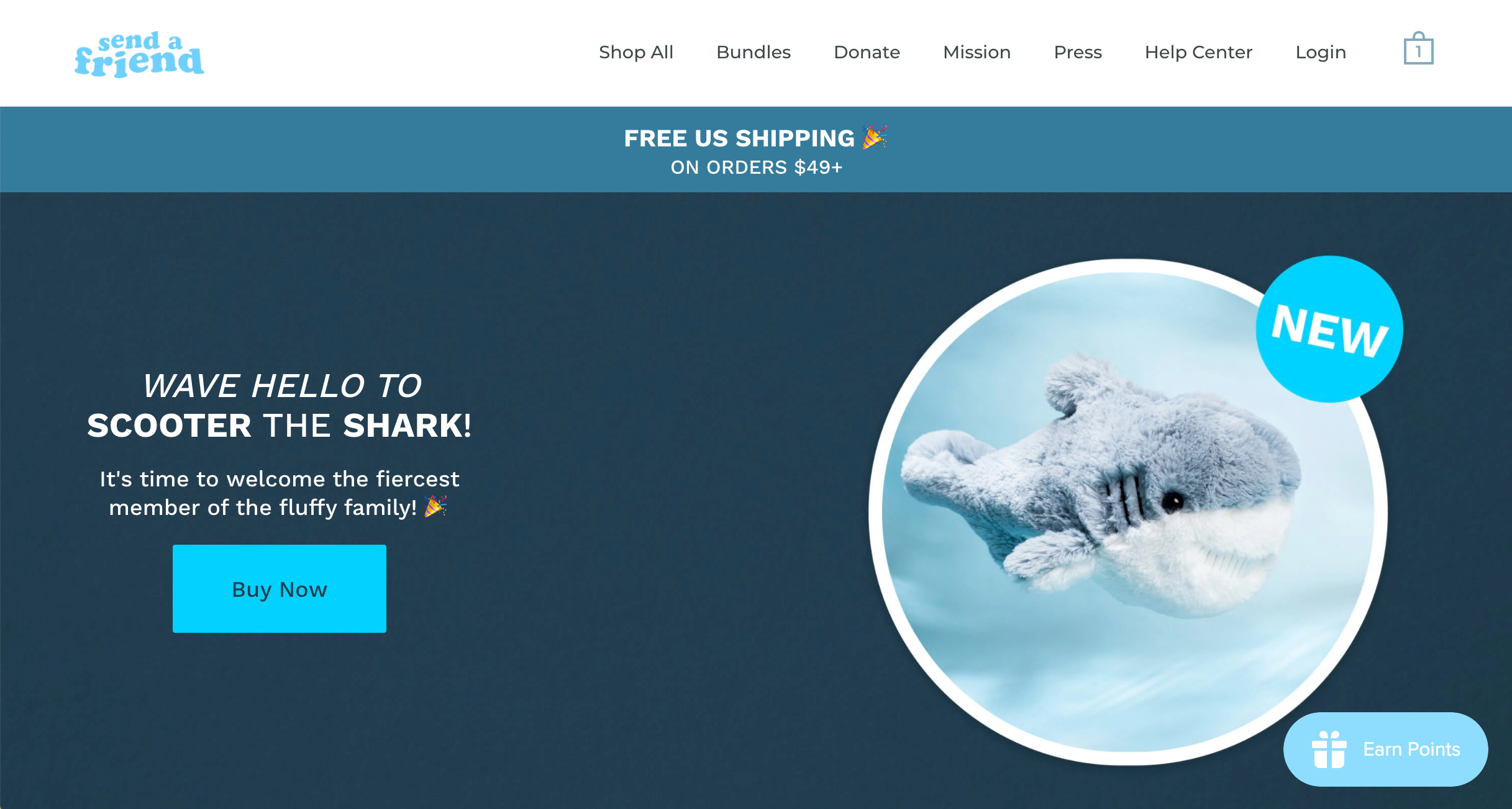
A new shark toy? Okay that’s cool but where’s the penguin I saw in the ad? Also, there’s no mention of the 10% discount anywhere. I’ve already forgotten what the code is and if I make it to checkout how am I going to find that code again?
Where I land on the site is almost wholly irrelevant to the ad that I just saw.
Let’s spend 5 minutes trying to make it more relevant:

What did we do?
1. Updated the headline
This term ‘brighten someone’s day’ is used in a number of their other ads. I assume it resonates with people because that’s the value you’re going to get from buying a send a friend.
2. Updated the body copy
Again, this is pulled directly from the ad. Instead of introducing people to a new product, we’re explaining how send a friend works and the fact it gets delivered right to their doorstep.
3. Updated the Button Copy
Instead of ‘shop now’ or ‘buy now’ we say ‘find the perfect gift’. This implies that we’re going to send people to an assortment of options they can choose from. It’s simple, easy to understand, and relevant to the ad.
4. Updated the Imagery
The point of the ad wasn’t to sell the penguin stuffed animal specifically. So instead of one large image we pull a few of their other styles onto the page. The goal would be to pull images of their best selling stuffed animals so we can peak the interest of the visitor. We also include the penguin and purposefully make it the largest image so that there’s continuity from the ad to the landing page.
4. Changed the announcement bar
The original announcement bar for free shipping is great but more importantly we want to reiterate to people that they have a 10% off discount they can use. If the ad mentioned free shipping we could include that in the copy as well.
This landing page hero is now much more relevant than the standard homepage hero. That’s one reason why landing pages are powerful. Unlike your home page you can customize the copy, images, and layout to be hyper relevant to the ad you’re running.
One ad x one offer x one landing page is a pretty powerful formula.
Distractions Kill Conversions
Landing pages have an added bonus of not being the default experience. They’re hyper-targeted for a single purpose which means you can remove a lot of the fluff that’s needed with a typical e-commerce experience.
Let’s look at the landing page updates we made again:

While this is now relevant to the ad, there are still a number of distractions. Namely - that navigation bar.
Hick’s Law states that the time it takes to make a decision will increase exponentially with each additional option.
That means:
1 option – 2 seconds
2 options – 4 seconds
3 options – 8 seconds
4 options – 16 seconds
5 options – 25 seconds
And so on… While we may actually be talking in milliseconds it helps to think of it in these extremes. A single distraction can cause someone to lose their train of thought and forget why they were so excited about your offer in the first place.
Remember – attention is gold. Don’t throw it away on frivolous things.
With this in mind, let’s spend a couple minutes making changes to the landing page:

What changed?
1. We replaced the navigation links with another CTA
Navigation links are attention-sinks. The previous nav had links to ‘donate’, ‘mission’, ‘press’, etc… These may be good to have for the average visitor but on a landing page they’re a distraction. Our primary goal here is to get the user to start shopping. Anything else is a distraction.
In place of the navigation we added an identical CTA to the one in the hero. This reiterates that the only thing you can do here is start shopping or leave.
2. Changed the announcement bar
Telling people that they can use a discount code requires them to think. We want to remove any and all friction making it as easy as possible to take our offer. So instead of showing the code we automatically apply it to their cart.
This can be done by creating adding a special link to each of the CTAs:
https://www.your-store.com/discount/DISCOUNT-CODE?redirect=/product-handle
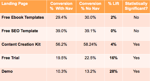
What we’ve done here may not seem like much but here’s an anecdote from the SaaS world – Hubspot saw a 28% increase in demo sign-ups on a landing page when they removed navigation links.
Again, preserve attention at all costs.
Flipping the content’s order from offer-first to education-first
This last bit is inspired by Dave Rekuc talking about why landing pages are effective:

As he says:
“The PDP puts the offer as the very first thing you see and new users don’t have the information they need to make a decision so they frequently choose inaction…”
A helpful model for thinking about this is the FOGG behavior model:
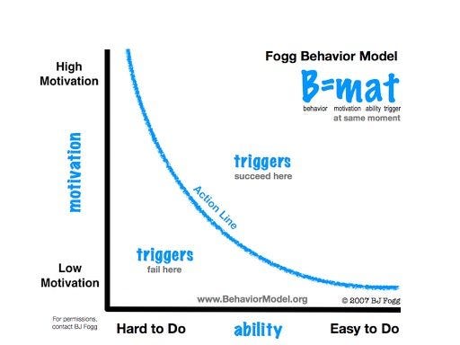
This model argues that someone needs to be sufficiently motivated and sufficiently capable of taking an action when you present them with a trigger (aka: call to action).
As Dave mentions, new users aren’t ready (aka: able) to make a purchase decision. You’re presenting them with the trigger to buy your product before they’re sufficiently capable.
How much information people need in order to make a decision is often directly tied to how complicated your product is. Something like a plush toy from Send A Friend can be bought impulsively. Whereas an electric bike or mattress would take a lot of consideration.
Landing pages can ‘flip the order’ from offer-first to education-first, making it more likely that users are capable of making a purchase decision when they see your offer.
This may also be why brands like eightsleep are having success with Product Landing Pages that precede the Product Detail Page across their entire site:


But this is a topic for another issue :)
————————
That’s all for today’s issue. As always, if you enjoyed this issue please give this tweet a retweet or like on Twitter:
