
I was on a call with the founder of a DTC brand this week. Her company hasn’t quite hit its stride so she was wondering.. why are things not working?
As we went back and forth she had a very specific question:
“Why the heck does the Magic Spoon website work so well?”
To her, their website was so simple. Almost too simple she said. They only have one product after all. Their home page only uses 236 words.
To me, the answer is clear.
But first, who is Magic Spoon

Magic Spoon sells ‘adult cereal’. As a kid, you can eat all the fruit loops you want and not consider its impact on your health. But as an adult you know a bowl of sugar for breakfast isn’t going to work.
In terms of their website, how well it works is mostly speculation. They have some famous backers like Ryan Holiday and are advertising on popular podcasts like The Tim Ferris Show.
Dumping money into acquisition can surely make anything look like it’s going well. Although, their 6,000+ reviews tells me people are converting.
The question remains, why?
I believe it comes down to one thing: focus.
What’s the opposite of focus?
When trying to define something it helps to illustrate its opposite.
Let’s look at the brand Waxing Kara.
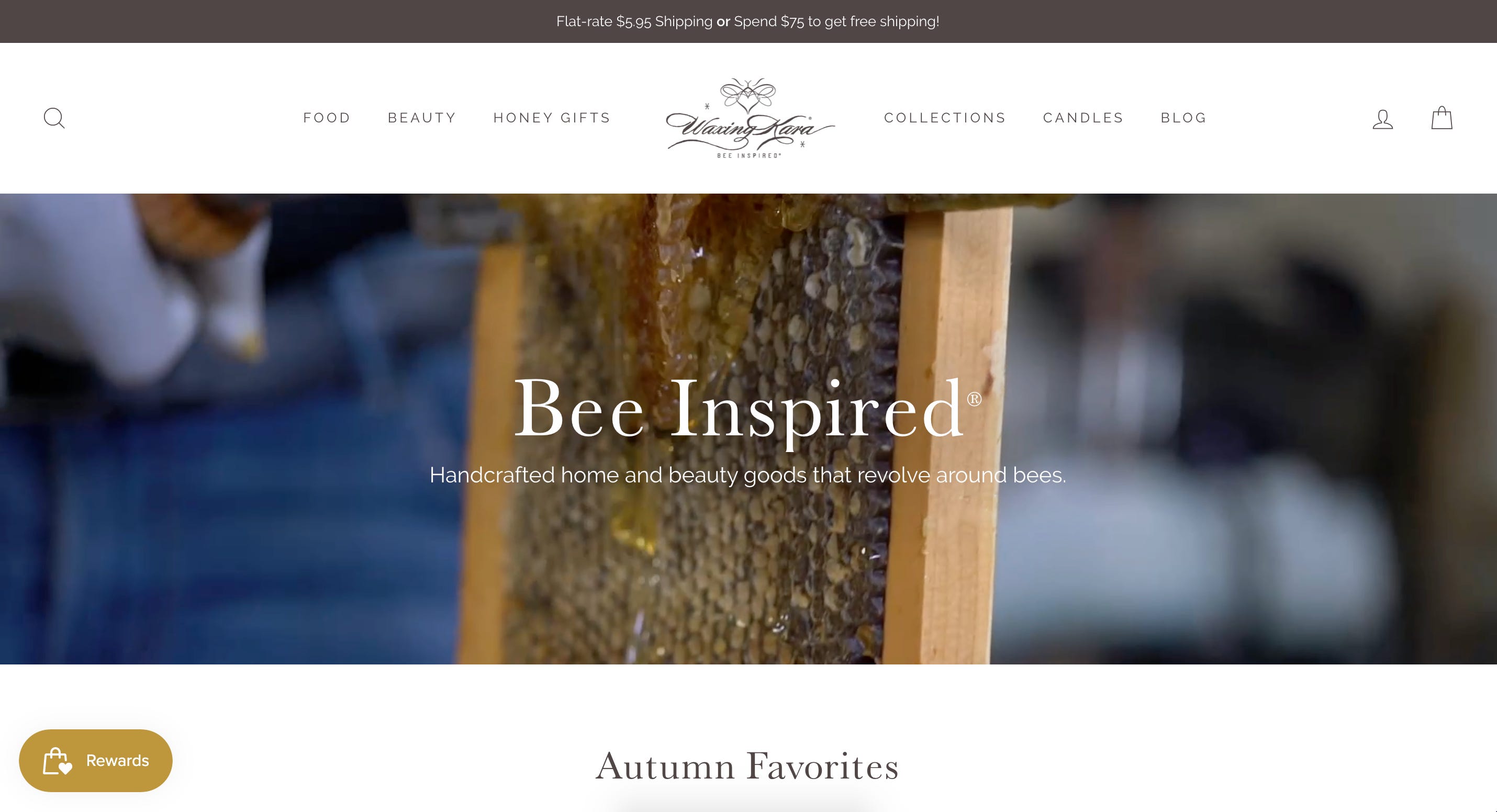
The site looks good. Nothing super fancy but it has high quality visuals, easy to read copy, and a layout that is easy to navigate.
Their positioning is “Handcrafted home and beauty goods that revolve around bees.”
This sounds specific. They sell products for people that care about bees. If they had a community of people who really cared about the health of our bee population this could really work.
The challenge is, who is this website for? Remember, people have needs, and your website needs to very clearly explain how your product will solve them. If they don’t have a use for your product, it doesn’t matter what cause you’re supporting.
For Waxing Kara, they have beauty products, home goods, and food products. When you land on the home page it doesn’t speak to anyone (or any problems) specifically.
To put it another way, their messaging isn’t focused around a specific market with a specific problem.
Magic Spoon’s hyper-focused messaging
When you land on the website the first thing you read is:
“Healthy cereal that tastes too good to be true.”

They then follow that up with quotes from reputable news outlets generally saying “this is a great tasting healthy cereal.”

Finally they back up their claims with facts about their cereal:
Packed with protein
Only 3g of carbs
Sweet & delicious
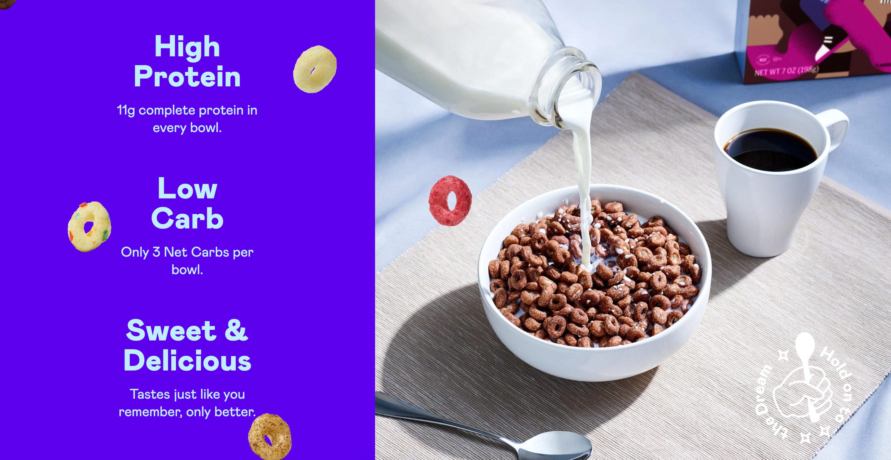
Just from reading this you can determine exactly who they’re speaking to: someone who loves cereal but can’t find any healthy options that taste good.
This person has one of two problems:
Currently eats cereal because they love it but know it’s bad for them
Currently eats other “healthy” cereal brands that don’t taste good
Magic Spoon’s website is crafted with these problems in mind.
If you’re one of these people, you know Magic Spoon is a potential solution to your problem.
If you’re one of these people, you’re probably willing to give it a try. In other words, you’re likely to convert if you can trust the claims they’re making.
That’s the effect your website will have on a person when your messaging focuses on a specific customer with a specific set of problems.
That’s all, folks
Alright, that’s it for issue number 7! If you enjoyed this issue, please retweet the Twitter thread:


Hey Shane,
I appreciate the write-up about our consultation, but I'd like to add some important context that wasn't captured in your article.
When you described Waxing Kara (now Bee Inspired Goods) as lacking focus ("who is this website for?"), you missed some crucial industry context. As a health and beauty brand that revolves around bee products, we operate in a highly regulated space where making direct claims about solving health problems can quickly cross into territory that would violate FDA regulations.
The challenge we discussed wasn't about focus—we know exactly who our customers are and what problems our products help with. The real challenge is communicating these benefits without making medical claims that would run afoul of regulations.
Unlike Magic Spoon, which can directly state nutritional benefits ("packed with protein," "only 3g of carbs"), health and beauty brands face much stricter limitations on how we can describe our products' effects.
This regulatory environment creates a unique challenge where being too focused and problem-specific in our messaging can actually create legal liability. We've had to develop more nuanced approaches to communicate value while staying compliant.
I think this regulatory context is critical to understanding why certain DTC websites in the health and beauty space appear to communicate differently than those in food or other less regulated industries. It's not a lack of focus—it's strategic compliance paired with effective messaging.