
Where to Start When Optimizing Your Store
Where to Start When Optimizing Your Store

Hey I’m Shane, welcome to another issue of The CRO Weekly where each week I explore how to build a high converting Ecommerce store. If you’re not subscribed you can do so here:
Conversion rate optimization (CRO) is all about changing someone’s behavior.
When a visitor sees your current PDP, there’s a small chance they hit that add to cart button. Your goal is to make a change to what they see on the page that makes them more likely to hit that button.
It’s pretty simple in that way.
The part that’s often overlooked is that people need to see the change you’ve made for it to effect their behavior.
When you take that idea to its logical conclusion, it tells you that there are 3 important factors when deciding where to start optimizing.
First, how many purchasers are you influencing?
Say last month you had 100,000 visitors and 2,000 orders for a conversion rate of 2%.
Of that 100,000 visitors
33,000 of them viewed the home page (33%)
47,000 of them viewed a collection page (47%)
70,000 of them viewed a product page (70%)
6,000 of them viewed the cart page (6%)
This is a hypothetical but I’m pulling these percentages from a real store’s analytics.
Thinking about the number of visitors to each page it’s tempting to say that we should ignore the cart page because not a lot of people see it.
But what’s more important than total number of visitors is the total number of people that made a purchase. Of the 100,000 visitors, only 2,000 bought something.
Of the 2,000 people that bought something:
– 1,000 of them saw the home page (50%)
– 1,300 of them saw a collection page (65%)
– 2,000 of them saw a product page (100%)
– 2,000 of them saw the cart page (100%)
A test on the home page that increases conversion rates by 10% results in 100 (1,000 * .10) extra orders each month.
A test on the cart page that increases conversion rates by 10% results in 200 (2,000 * .10) extra orders each month—2x the results of the test on the home page.
That’s why instead of using overall traffic numbers you should look at which pages have the highest % of visitors that go on to buy something. This is usually your cart, PDP, and landing page(s).
Second, most people don’t scroll
Take a look at this image:

This is a “scroll map” showing what percentage of visitors make it to a certain point on your page. I’ve looked at a bunch of these and one thing holds true—50% of people don’t make it past the buy box. Most people barely scroll past ‘the fold’.
That means 100% of people that land on your PDP see your product media carousel, title, review count, (maybe) description, and the product options. Anything below that is only seen by a fraction of visitors.
This holds true on other pages as well.
Note—The data gets a bit complicated when you try to sort out what percentage of people that purchase your product make it past the buy box. There could be a scenario where that 50% of people who scroll make up 100% of purchasers. It’s also messy because people will look at your reviews (at the bottom of the page) but not read any of the other content.
For the sake of this example let’s keep it simple—the majority of people will see the content in your buy-box whereas a lot less people will see anything below it.
That means if we run a test on an element below the buy box it only has the potential to influence a fraction of visitors. This tells us that tests on elements in the buy box have a higher potential impact than anything below it.
Finally, Visual Hierarchy Matters Too
Spot the difference between these two images:
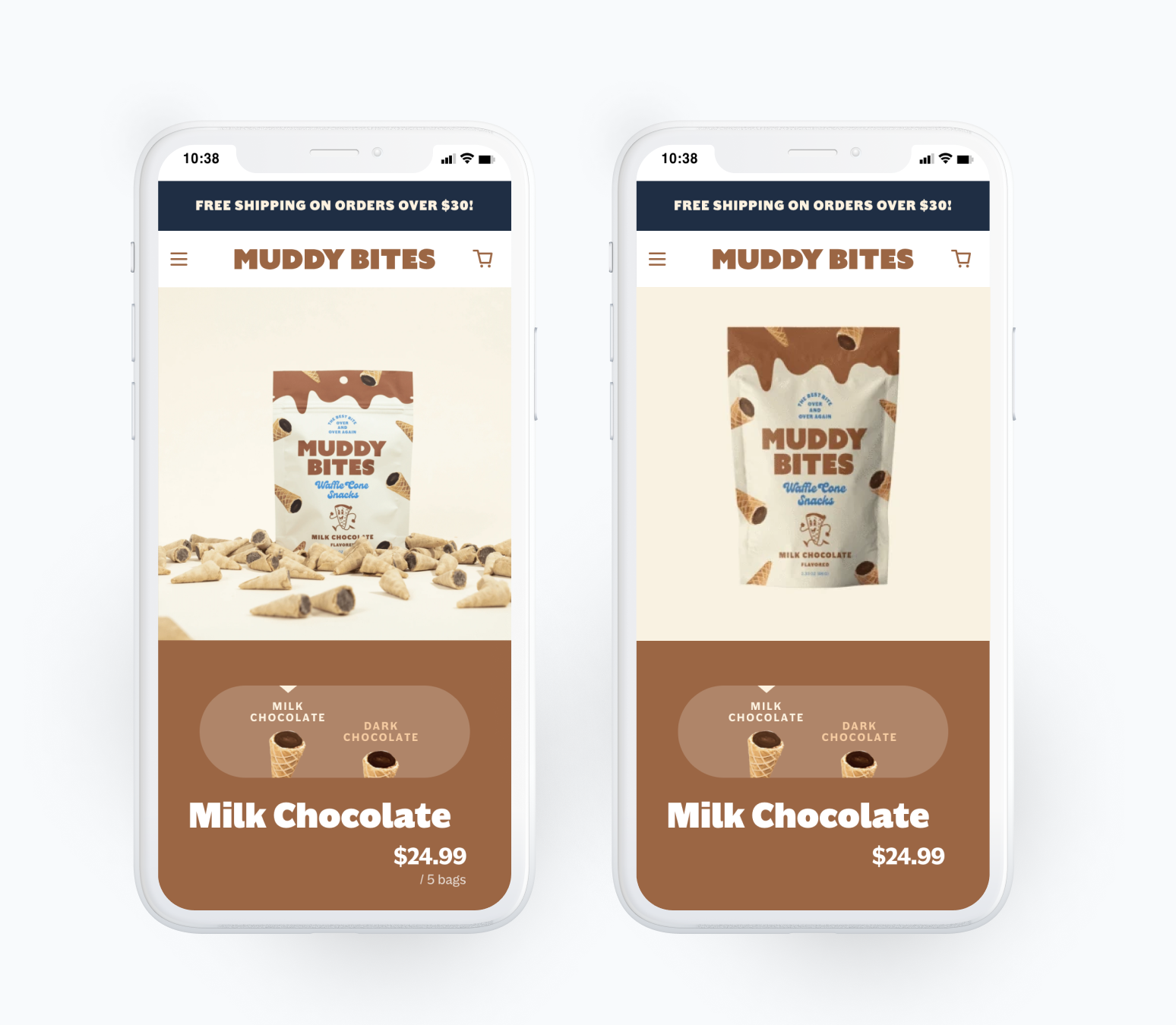
Easy, right? The image is clearly different.
But did you notice that the pricing changed too? Instead of “$24.99 / 5 bags” it just says “$24.99”.
The image is one of the largest elements on the screen and contrasts with the rest of the page. The text “/ 5 bags” is the smallest element on the page and has low contrast with the background.
Give it a squint test (squint your eyes and look at the screens) and you may not even see the “/ 5 bags”.
In other words, the image is high on the visual hierarchy and the pricing text is low. (Read this issue on visual hierarchy to learn more)
The higher something is in the visual hierarchy the more noticeable it is. The more noticeable it is, the more people will see it. And you’ve probably gotten this by now – the more people that see it, the higher chance it has to impact their behavior.
Taking all of these things together you want to focus your optimization efforts on:
Pages that are visited by a large % of purchasers
Sections that are ‘above the fold’
Elements that are easily noticeable within 5 seconds of landing on the page
Only once you’ve exhausted the opportunities that fit this criteria should you start to consider anything else.
That’s it for this week’s issue. I’d love to talk to you about it on Twitter:

This topic was inspired by two reader questions:
“I think the struggle is coming up with tests that really move the dial enough to give client confidence to more and do it quickly.” – Simon
“People will say shit all the time like “our conversion rate is 2%” but that’s so general. What pages should you hone in on.” – Monica
Email me if you ever have questions about CRO. I try to respond to every message!